NAVYA ADIPUDI
Rueda Design
Translating Craftsmanship and Clarity Into a Timeless Digital Experience.
The Rueda Design website redefines the online presence of a premier custom office furniture studio, reflecting the craftsmanship, precision, and modern minimalism behind their work.
Our goal was to create a site that not only showcased exceptional design solutions but also felt timeless—balancing interactivity and restraint to mirror Rueda Design’s philosophy. The final version builds upon the foundation of an earlier design while resolving stakeholder misalignment, resulting in a more refined, unified digital experience.

Role
Sole UX/UI Designer
I was responsible for user research, interaction design, prototyping, component systems, and developer handoff. I collaborated with the development team to ensure design clarity and consistency through final implementation.
Team
Founder / Creative Director
Development Team
Timeline
Version 1: January 2024 – April 2024
Version 2: July 2025 – October 2025

The Challenge:
The original redesign sought to reposition Rueda Design as a high-end, forward-thinking furniture brand—a studio that solves complex design challenges through craftsmanship and precision.
However, midway through the process, conflicting stakeholder visions surfaced: while one stakeholder favored expressive visual storytelling, the other preferred strict minimalism and functional clarity. The result was a misaligned brand tone that required a full return to the drawing board over a year later.
The v2 redesign became an exercise in balance and refinement—how to evolve an existing design system to be both immersive and understated.
Understanding the Audience
Rueda Design’s audience includes architects, designers, and corporate clients seeking custom, high-quality furniture solutions. They value elegance, precision, and innovation in both product and presentation.
Pain Points:
-
Previous site felt clunky and text-heavy, diluting the sophistication of the brand.
-
Navigation lacked flow and visual clarity.
-
The storytelling didn’t capture the scale and craftsmanship of Rueda’s work.
-
Stakeholder misalignment created brand inconsistency in tone and layout priorities.
Competitive Analysis:
-
Halcon Furniture: Highly informative but visually overwhelming; lacked restraint.
-
Mash Studios: Clean and minimal but under-communicative—didn’t convey uniqueness.
-
Studio Other: Interactive and well-structured but visually heavy and too casual in tone.
Opportunity: Blend the visual polish of Studio Other, the clarity of Mash, and the refinement Halcon lacks—a space that feels modern, timeless, and intentional.

The Problem
Rueda Design needed a website that communicated precision and craftsmanship through clean structure, engaging interaction, and timeless design restraint.
The design needed to:
-
Reflect Rueda Design’s premium craftsmanship through high-contrast visuals.
-
Be immersive without clutter, guiding users intuitively through content.
-
Support a smoother sales journey, from portfolio viewing to contact inquiry.
-
Withstand stakeholder turnover through a consistent, scalable design system.

The Solution
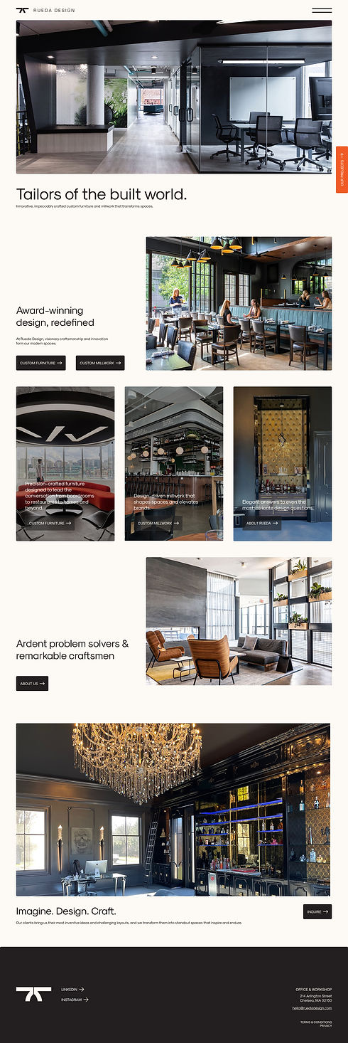
The first iteration introduced an interactive, visually rich site designed to captivate through motion, scroll-based storytelling, and product animations. It showcased scale and process through large imagery, microinteractions, and horizontal scroll sections inspired by high-end industrial design sites.
The second iteration refined, not rebuilt—preserving the structural integrity of version one while embracing a minimalist visual language that aligned with the founder’s aesthetic. The new design removed curvature, simplified color use, reduced whitespace, and prioritized layout clarity and product focus over animation.
This evolution demonstrates how UX adaptability and design restraint can transform the same content into two distinct, yet effective experiences—each reflecting different aspects of brand identity.
Design Ideation:
Version 1:
Focused on high engagement and scroll-based storytelling, taking cues from Apple’s motion design and Studio Other’s section-based flow. Large imagery and bold typography created a sense of depth and craftsmanship, while horizontal scrolls allowed users to explore product categories fluidly.
Version 2:
Shifted toward simplicity and spatial harmony—less motion, more focus. The redesign maintained the functional logic of V1 but emphasized balance, breathing room, and hierarchy. The process became a case study in how to subtract without losing meaning—reducing the interface to its most essential, confident form.
HiFi Prototype:
Both versions were fully prototyped in Figma. For v2, I rebuilt component libraries for flexible reuse and scalability, ensuring that the development team could implement updates seamlessly across pages.
Typography, spacing, and contrast were reworked to enhance accessibility and reinforce the timeless, architectural aesthetic.
QA Process & Revision:
In version one, I actively managed QA—tracking component behavior, verifying hover interactions, and ensuring responsive consistency across devices.
For version two, QA was handled primarily by developers. I ensured handoff precision, defining clear component states, responsive rules, and interaction notes so that development could execute efficiently in a single build cycle, rather than page by page.
The Results:
-
Modernized brand presence aligned with Rueda Design’s identity and caliber.
-
Improved scalability through a modular design system adaptable to future content.
-
Streamlined navigation and readability, improving usability and aesthetic clarity.
-
Reduced visual noise, allowing photography and product storytelling to lead.
The redesigned site elevates Rueda Design from its older, text-heavy format to a refined digital flagship—one that finally matches the sophistication of the brand itself.
The Results
This project became more than a redesign—it was an exercise in stakeholder communication, design iteration, and restraint.
Version one taught me the power of immersive storytelling; version two reinforced the value of clarity and alignment. Together, they reflect my ability to balance competing visions while maintaining a cohesive, user-centered product.
It’s a reminder that the best design outcomes come from empathy—both for the user and for the team behind the brand.