NAVYA ADIPUDI
THE PROBLEM
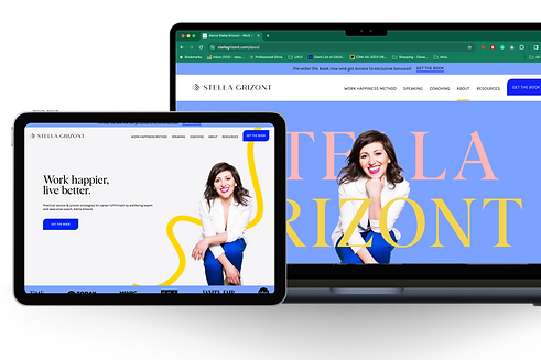
Stella Grizont's initial website, though functional, needed refinement to better reflect her vibrant brand and the Work Happiness Method. The design posed challenges in optimizing lead generation, offering a clear user journey, and aligning with Stella's recent rebrand. Addressing the audience's expectations for insights, a streamlined purchasing experience, testimonials, and community engagement required improvement. This prompted the need for a comprehensive rebrand and website update to create a more positive and effective online presence.
THE BRIEF
Stella Grizont, a renowned happiness expert, seeks a comprehensive rebrand and a new website to promote her upcoming book, "The Work Happiness Method," and elevate her online presence. The primary goals include representing Stella's vibrant brand, enhancing lead generation, streamlining the user journey, and aligning the website with her recent rebranding efforts.
THE TEAM
Kate Zeitler- Agency Owner, Communications with client + development team + design, Branding, Graphic Design
Navya (Me) - UX & UI Design, Graphic Design
Copywriter
Developers
THE TOOLS
Figma
Adobe Illustrator
Canva
THE TIMELINE
August 2023- December 2023
Live on January 1, 2024
THE PLAN (& MY ROLE)
After Kate solidified the rebranding for Stella, we began work on Stella's website.
Below is the approach we took (my work is in bold.)
-
UNDERSTAND: Branded Web Direction Deck (contains : Website Goals, Goal Statement, Target Audience, Things to Focus On, Things to Avoid, Competitive Audit, Homepage Flow Ideation, Graphic Treatment, Design Direction Examples.
-
IDEATION: Paper Wireframes of Design options for Homepage (base for other pages as well)
-
DESIGN: Hi Fidelity (HIFI) Mockups (including designing page flow, section designs, UI elements)-> Client Review
-
Copywriting (I briefly participated in this)
-
Development
-
Client Review + Launch
Understand
THE GOALS
1
Enhance lead generation and sales funnel strategy. The website must be geared towards collecting emails from individuals and organizations.
2
Improve content presentation and design. Create updated and strengthened informational pages, better integration of testimonials, purchasing sections, and overall design enhancements.
3
Evoke a calm joyful feeling & build trust. Design and content must be in harmony with client ethos. Website must establish trust and engagement with the audience.
THE TARGET AUDIENCE WANTS TO
Gain insight into the work happiness method. Site visitors want more information about transforming their well-being in the workplace through courses, speaking engagements, and personalized coaching.
Find testimonials and resources. Visitors want to easily find and explore testimonials and free resources that demonstrate Stella's expertise and ability to promote well-being and happiness in the workplace.
Be guided through the purchasing process. Visitors want to be guided through a simple and intuitive process to purchase books, courses, or book a call.
Feel a sense of community and connection. The design should be inviting and sophisticated, and the content should resonate with visitor's desire to succeed in finding joy in their professional lives.
COMPETITIVE AUDIT

Ideate
DESIGN DIRECTION

Paper Wireframes
Below are some key takeaways from the feedback on these sketches.
The Line Motif. Stella's book, The Work Happiness Method, features cover art of an organic, colorful line. The line symbolizes how there isn't one linear path to happiness. While doing paper wireframe explorations, we decided to incorporate these colorful lines into the web design.
Testimonial Carousels and fun ways to show information. Especially for the homepage, Stella wanted to show her offerings and expertise in a way that would be easily digestible but still give the user all the information needed.
Fun colors. Stella is a vibrant, joyful individual- and her brand and brand design echo that. We wanted the various pages on the website to echo that sentiment as well.

HiFi Mockups


Design Motifs (UI & Design Choices)
Below are some of the elements I specifically designed for this project.

Button Variations
On the right are the various button variants (some are hovers) as a component. The recurring "leaf" shape motif in the rest of the website's design was derived primarily from this design choice as a simple way to add interest and uniqueness to a common shape. I designed these variants to adjust to the length of text, and the hover interactions to solidify the CTAs.
Organic Lines
On the left is an example of a vector line graphic we used throughout the website. Inspired by the cover design of Stella's book, The Work Happiness Method, the squiggly lines represent the non-linear path to success and joy. By incorporating these lines in Stella's brand colors throughout the website by overlapping images and cards over the lines we helped establish her unique brand.


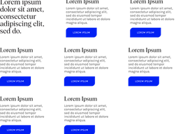

Informational Text Blocks
The top image on the right is an adjustable component showing various grouped information blocks. The buttons and/ or body can be hidden, and the height of each section adjusts based on the amount of text in the body (or title). The component comes with seven text blocks, however, the text blocks can be hidden as per needed, and the component width/height and layout will auto-adjust. If needed for the design the bounding box can also be adjusted to manipulate the layout of the section.
The bottom image shows the component adjusted as needed for the section; the text has been modified, and only three information blocks were needed. This section's image also highlights the use of the leaf shape button, and the organic lines overlapped with Stella's image.
.png)
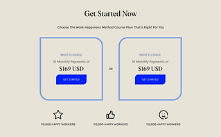
Pricing Section
The pricing section is an example of the leaf shape motif being used in various ways throughout the website. We took inspiration from successful pricing sections of competitors in Stella's industry. I made this design to allow for various colorways (easily customizable) to help the design flow naturally from section to section.

Press & Media
On the right are two sections from competitor websites we were inspired by for Stella's Press and Media archive. On the left is the actual design I made for the website. We wanted the company/ brand name Stella is featured in to be prominent, as well as the title of the article, so those are in the left column. The CTAs are prominent and are on the right-most column.

Reflections & Feedback
I LOVED working on this project. It's amazing to see significant design work I have done and UX/UI work be live for anyone to check out. This project was also a great way to stretch my design skills; Previously, having worked on a SaaS project, it meant I had to stick to simple, soft, and established UI that was generic in its styling. While this is GREAT for projects of that nature, working on Stella's website meant that I got to experiment with different colorways and design choices, while also maintaining a smooth user journey. A complete rebranding + redesign also meant that everything being designed was created from scratch, which was a great way for me (as the team's UX/UI designer and "Figma person") to create components and elements that would then be adjusted by Kate and me in the actual designs; I had to make sure these elements were properly designed to be able to hand over to the dev team and well structured so that they could be used numerous times throughout the website design. Overall, this project allowed me to learn even more about being an advocate for a user as well as designing a proper website for a client.
Below is some feedback from Kate (my boss and owner of the creative agency I work for.)
Ah you should be so proud of your work on it!!! It’s truly the best site we’ve ever done!! - Kate Zeitler
Check out the live website to see the full designs in action!